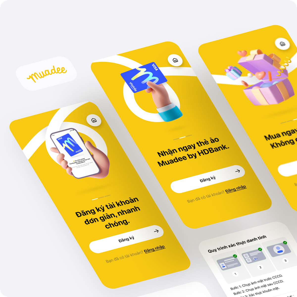
HDBank asked us to launch Muadee, a Buy Now Pay Later product, in ten months. We had no proven local need to start from. What we had was a product model that had already worked in the international market, and a Vietnamese market we believed was ready for it.
Blocked byNo proven local need to start from, and a ten-month deadline that left no time to discover one the usual way.
The usual discovery framework starts from a user need and searches for a solution. That was not going to work here. I inverted it: Muadee did not start with an idea to solve a need, it started with a product model that had already succeeded in the international market, tested against a Vietnamese market we believed had room for it but had not yet been served.
We committed to launching Muadee internally as a BNPL product within ten months, then scoped an MVP built to test that borrowed model rather than to prove a discovered need.
Discovery as taught
Discovery for a borrowed model
Start from a user need
Start from a proven model
Find the opportunity
Map the opportunities
Validate the idea
Test the product hypothesis
How discovery was inverted for a model with no local need yet proven.
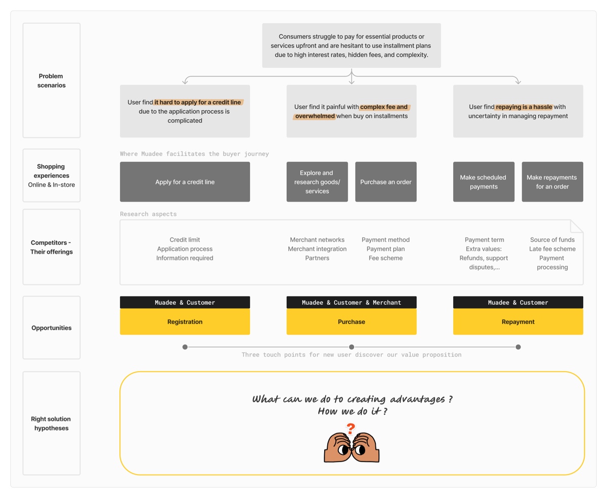
Opportunity analysis
The opportunity analysis board: the shopping-with-installments problem, how competitors already served each piece of it, and the three touch points (Registration, Purchase, Repayment) it resolved into.
Muadee project document, HDBank. Source document 02Unpack the demand hypotheses
Blocked byA borrowed model came with untested assumptions about Vietnamese customers: what they'd consider unsafe to share, and whether eKYC and eSign meant anything to them yet.
We mapped our opportunities as a team, breaking the shopping-with-installments journey into the three touch points where customers actually struggled, then unpacked each into a hypothesis we could test rather than assume.
For registration, that meant naming the assumptions plainly: what information a customer would consider unnecessary or unsafe to give, and whether they already understood eKYC and eSign before we asked them to use it. We hoped to maintain a conversion rate of roughly 70%: a hypothesis, not a result.
Measured across the registration steps over 30 days, it reached 84.3%.
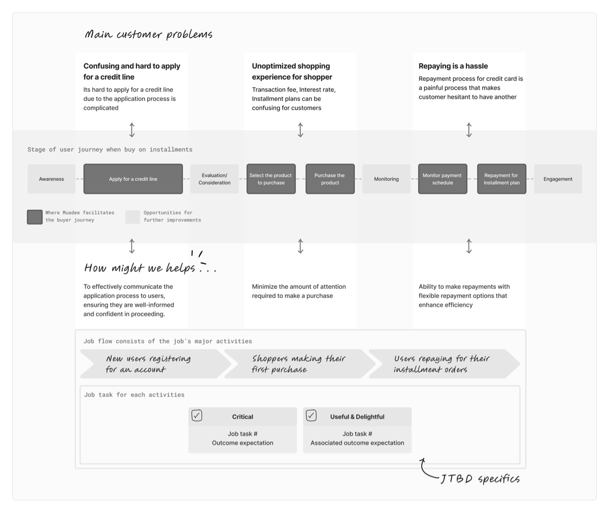
Main customer problems
Confusing and hard to apply for a credit line
To effectively communicate the application process to users, ensuring they are well-informed and confident in proceeding.
Unoptimized shopping experience for shopper
Minimize the amount of attention required to make a purchase
Repaying is a hassle
Ability to make repayments with flexible repayment options that enhance efficiency
Legend in the source diagram: dark node means "Where Muadee facilitates the buyer journey"; light node means "Opportunities for further improvements."
The Opportunities tree: three customer problems, each unpacked into a testable how-might-we.
Opportunity map
The JTBD opportunity map behind the Opportunities tree beside it: three customer problems plotted against the nine-stage installment journey.
Muadee project document, HDBank. Source document 03Registration is the product
Blocked byThe traditional way to get a credit line took one to three days, too slow for a purchase happening at checkout right now.
Applying for a credit line the traditional way took at least 1–3 days. We chose to provide BNPL through a credit card issued in just 4–6 minutes of registration instead. Registration itself became the product we were designing.
We formed usability hypotheses for each piece doing that work: eKYC, the Muadee virtual credit card, RE processing and eSign, then tested whether customers understood each step well enough to keep going.
Traditional credit line
Muadee registration
1–3 days to activate a credit line
4–6 minutes to a card issued at registration
Identity verified at a branch visit
Identity verified through eKYC
Contract signed on paper
Contract signed with eSign
Registration compresses what used to take days into minutes.
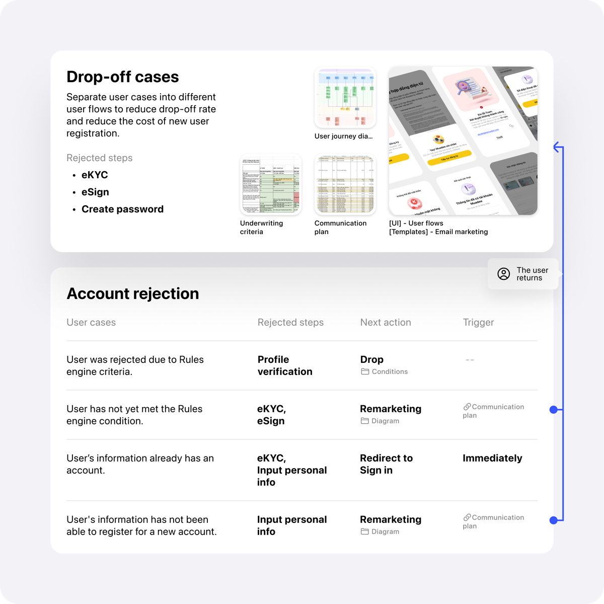
Account rejection
The account-rejection paths this registration flow had to design for. A case can be rejected four ways (profile verification, eKYC, eSign, personal info), and each one ends in a drop, a remarket, or a redirect to sign in.
Muadee project document, HDBank. Source document 04Three flows, then the words
Blocked byThree separate journeys still needed designing at once, and nobody had checked yet whether the screens' own words were part of the problem.
We designed three flows in parallel: registering an account, purchasing an order online, and following a repayment plan. Each was built around the moment we expected a customer to hesitate.
Once the flows shipped, we ran a content audit against what customers actually read on screen, turning irritants and confusing terms into a to-do list rather than leaving them as assumptions.
Issue
To-do
Content audit: use of a term causing confusion (Irritant)
Content audit
Content audit: minor confusion about credibility and value received while performing a task (Want)
Revise content frame
User flow: step requirements conflicting with user expectation during the journey (Moderate)
Pending
User request: value-added services (Want)
Pending
User interface: composition not matching the user's mental model (Irritant)
Desk research
The content audit: theme, issue and severity, each with its own to-do.
Registration & card screens
The registration and card-issuance screens whose copy the content audit in this chapter reviewed.
Twelve boards from the Muadee project document, in the order the work happened: the model borrowed, the opportunities unpacked, the hypotheses written down, the flows drawn, and the number that came back.
The project document's own cover, claiming what the case claims: one of the bank's first BNPL launches in Vietnam.
The whole file at once: a flow tree on the left, then page after page of screens. Illegible on purpose, like every board here. It is the scale that is the argument.
Three problem scenarios resolving into the three touch points, then each one broken into a right-solution, a feature-relative and a usability hypothesis. The margin asks the three questions that decide whether a hypothesis is worth testing: value level, feature level, design level.
The same five columns the product shipped as: Registration, Explore merchants, Purchase an order, Manage payment schedule, Repayment. Each with the hypothesis above and the features that would test it below.
Jobs to be done for three customers, split into Critical and Useful & Delightful, then carried down into epics and tasks banded as Threshold, Performance and Excitement attributes. This is where a customer problem becomes a backlog without stopping being a customer problem.
Five BNPL products compared line by line, and the strengths and weaknesses that came out of it. The weakness list is the useful half: mobile only, no account before registration, and a registration that has to satisfy anti-fraud and compliance regulation.
One how-might-we question answered across the whole task flow: what constrains each step, where the friction is, what the screen must say, and which call to action is primary. Content designed as part of the flow rather than written onto it afterwards.
Everything the MVP had to hold, grouped as Registration, Purchase, Repayment and the rest. The Registration row is BLURRED here on purpose: it is a real eKYC walkthrough and it shows identity cards and two identifiable faces.
Where the interface work sat before it started, plotted against effort, with the designer's and the developer's estimates marked separately because they disagreed.
The path for a customer who reaches the e-contract and says no. Two reasons it exists, both written on the board: users change their minds and need a marked exit, and a refusal is the one moment the business can still ask why.
What the app does with the minutes an approval genuinely takes: a countdown, an honest sentence about the wait, and an offer to be notified instead of watching it.
Where the 84.3% in the strip above comes from. Averaged across the registration steps over 30 days, and the board says the part a headline would drop: the figure does not include credit approval.
Boards from the Muadee project document, HDBank. One board carries a redaction, named in its caption.
Prototypes
Two of the three touch points, as they ran.
Four prototypes from 2022. The case argues that the journey resolved into Registration, Purchase and Repayment; these are Purchase and Repayment, recorded before the build. Registration was recorded too and is held back: that clip runs through eKYC, and it prints an identity card, a date of birth and a face.
2022 · Purchase in a shop: scan the merchant's QR, choose a tenor, confirm with an OTP, and see the three instalments before agreeing to them, not after.
2022 · The same purchase online, inside Lazada's own checkout, where Muadee is one payment method among several and has one screen to explain itself.
2022 · Repayment: everything due this month across three merchants, settled in one transaction rather than three.
2022 · Paying ahead: two of three instalments, or all three, and what the schedule looks like afterwards.
Prototypes by the Muadee product team, HDBank, 2022. The card, order and phone numbers in them are masked demo data.
Reflection
After launch, drop-outs and rejections in registration outnumbered what a good conversion number could paper over. I traced them back to where user data actually failed (retriable input errors versus applicants who never would have qualified), then worked with the tech team to bring the fixable ones back without asking them to start over. A discovery-inverted process can validate a model fast; it still needs this kind of return trip once real users touch it.